
Martial Arts School Logo | Logo Design Case Study
- NB Media Solutions

- Nov 3, 2021
- 4 min read
Updated: Jan 29, 2025

Client: Marcus C.
Company: Warrior Meets Scholar
Martialist Training
Location: St. George, Utah
Project Details: Custom Logo
Design Approach: This is a case in which the client came into the design process with a very clear idea of what he was looking for. He knew exactly what font, color palette, and imagery he wanted to use. Because of this, the design process was largely about helping the client visualize different ways in which those elements could fit together. One unique consideration for this logo is that it had to print well on T-shirts and signage. Because of this, we focused on using a limited color palette with high contrast so that the image would make sense from a distance. We also limited fine details that might not print well on fabric.
Brand Story: Premier Martial Arts School
Marcus C. contacted NB Media Solutions for some contemporary ideas on a new logo for his business, Warrior Meets Scholar Martialist Training. Our lead graphic designer, Twila, went through various steps and processes to provide Marcus with our innovative logo recommendations and ideas. Our graphic designer created numerous logo variations for the client, and adjusted them to our client's exact liking, to finally come up with the perfect martial arts school logo.
Logo Design Research
First things first, we wanted to know a little more about Marcus' Martial Arts School and background on the company. To dig deeper, we asked our client questions like what text, fonts, colors, and taglines should be included in the logo? As for the imagery, what kind of visual representation(s) Marcus preferred for the logo, whether it's a leaf, tree, flower etc.?
Marcus explained that his business' name is Warrior Meets Scholar Martialist Training, but "Warrior Meets Scholar" is what he'd like included in the main logo. He also insisted on a short tagline: "Functional Philosophy in Motion". He explained his company's core values of integrity, service, and growth, and said that his business is a martial arts school that teaches Muay Thai Kickboxing, women's self-defense, combative weapon training, life philosophy and meditation.
Marcus enjoyed a graffiti font named Sedgwick Ave Display which matches the rugged style of his martial arts school. He preferred a few different colors in order to see how the logo variations would initially turn out, medium dark red and yellow with dark backgrounds of black or grey.
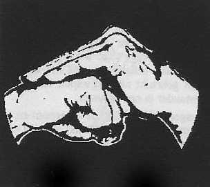
Marcus also threw out ideas for image representations; hands meeting with one hand open and one hand in a fist, and/or a mountain outline with a sun over the horizon. He explained that both images had symbolism to the school since the physical expression of the hands meeting mean "Warrior meets scholar" in Chinese Kung Fu.
The mountains with the sun over the horizon represent a strong immovable foundation with powerful energy showing over its peak. Both image representations meant something symbolic to our client, which gave us a bigger picture of what path to take this new martial arts school logo in.
Logo Design Examples:


Bringing a Martial Arts Logo Design To Life
Now it's time to design and get creative.
Are we going to include a sun's horizon with each imagery?
Do we want the hands on the first logo recommendation to take up most of the logo or just a portion of it?
How do we design the mountains, with thick or thin lines?
It was fairly easy for the martial arts school logo to come to life because Marcus had given us plenty of information on the background of his company and their values. This helped our graphic designer immensely knowing exactly what was to be included in the martial arts logo in order to represent Marcus' company, what they do, who they are, and what they stand for.
The initial martial arts school logo examples:


Logo Variations & Color
There's a lot of trial and error involved when a graphic designer designs a new logo.
Logo design is never a one-and-done deal because the designer is always going back to the drawing board in order to enhance the logo until the client is finally satisfied with the final logo design.
Marcus was very impressed with each logo design idea provided. He enjoyed the third logo with the hands and insisted on a version without the grey, distressed spots. Marcus wanted to use that third logo idea for the main martial arts school logo design, but said that the small grey details wouldn't last overtime with vinyl printed decals. Our client also insisted on different colored backgrounds so he could potentially include a martial arts logo on his business apparel, but he wanted the distressed effects included for the apparel.
The feedback that we acquired from the client helped us design the martial arts school logo with and without the distressed effects, and throughout various colors:


We were pleased to hear that our client approved the martial arts logo design with the plain (not distressed) background. He also wanted to use the mountain logo that was initially included in concepts for some wall art in his training studio. He preferred it without the words because the imagery represents his brand and is a play on his new martial arts logo.
Final martial arts school logo:


Client Testimonial
NB Media Solutions was glad to transform our client's brand into an awesome martial arts school logo.


Comments